As web developers, we deal with large amounts of data every day. Sometimes it helps to sit back and take a closer look at the data in hand and see what data is trying to tell.
Here, at Xlinesoft.com customer support is one of the most important parts of the business. We deal with a large number of emails and helpdesk tickets every day and, as a small weekend project, we decided to build a few charts to analyze those emails. We are sharing these results here and hoping that it can provide you or your clients with some insights.
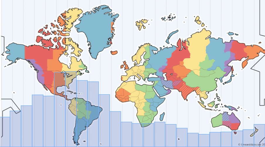
First of all, we analyzed incoming support requests by the hour of the day. There is no surprise that 9am to 1pm US Eastern time is the busiest time of them all as emails from Europe and tickets from both East and West coast are coming in. We grouped those emails by the hour of the day and placed them on the world map with timezones for easy digesting.
Here is the SQL query that we have used to pull and group data. Our local time is US Eastern Time (GMT +5) and we needed to adjust data in order to match it with timezones. This syntax applies to SQL Server.
How this chart is useful? It tells you what hours are the most important from the customer service point of view and if you were to hire a new support person you need to make sure they can cover all the busiest timezones.
select
DATEPART(HOUR, dateadd(hour,5,created)) AS [hour],
COUNT(*) AS [count]
FROM dbo.tblEmail
WHERE (direction = 1) AND (created > '2019-01-01 00:00:00')
GROUP BY DATEPART(HOUR, dateadd(hour,5,created))
ORDER BY DATEPART(HOUR, dateadd(hour,5,created)) desc
And also here are chart settings. Here we add a background image, remove the padding between bars, set the Y-axis scale to about 50% so bars do not completely cover the map, and also make chart bars semi-transparent. This code goes to ChartModify event.
// chart background
chart.background().fill({
  src: "images/timezones.png",
  mode: "fit"
});

// padding between bars
chart.barGroupsPadding(0);

// max scale to about 50% of the chart height
chart.yScale().maximum(8000);

// hide Y-axis
chart.yAxis().enabled(false);

// set series colors and transparency
var series1 = chart.getSeriesAt(0);
series1.normal().fill("#004499", 0.2);
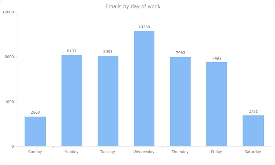
The second chart represents incoming emails by the day of the week. I was a bit surprised to see that Wednesday is the busiest day of the week. Go figure.
How can you use this info? You probably noticed, that most of our newsletters come out Thursday around lunchtime. We feel that most people are done with most of their work for the week and are more likely to read something else.
And here is the SQL query we used to build this chart. All other chart settings are pretty much default ones.
select
datepart(w, created) AS downumber,
DATENAME(w, created) AS dow,
COUNT(*) AS [count]
FROM dbo.tblEmail
WHERE (direction = 1) AND (created > '2019-01-01 00:00:00')
GROUP BY datepart(w, created), DATENAME(w, created)
ORDER BY datepart(w, created)