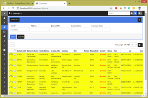
The search panel is displayed vertically on the left side of the List page by default. Sometimes you need to make it more prominent and place it above the grid, just like on the screenshot below.
Doing so is fairly simple.
1. Changes in Page Designer
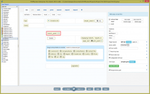
Proceed to the List page in Page Designer. Add a new line to the section above the section with Add/Delete buttons. Drag the search panel brick to that cell.
2. Custom CSS
Now we need to make sure that search controls appear horizontally and also that search panel takes the whole horizontal space. To do so we can use the following CSS code under Eidtor->Custom CSS. By default, all DIVs are displayed vertically, one under another so we needed to use float: left to make them align horizontally. More info about float property.
.form-group.srchPanelRow.rnr-basic-search-field, div.srchPanelRow.form-group {
float: left !important;
display: table;
margin: 5px;
}
It is worth mentioning that the following two tutorials helped us build this CSS.
Introduction to Custom CSS
Choosing the correct CSS selector


Better updated solution for the CSS to use is:
.searchOptions > .panel-body.controlsBlock {
text-align: center;
justify-content: space-evenly;
display: flex;
}
This will evenly distribute the search controls horizontally and center them :-)
Another css solution
.searchOptions > .panel-body.controlsBlock {
text-align: center;
justify-content: flex-start;
display: flex;
}
Hi
This code works correctly for the filter panel:
.filterPanelContainer {
display: flex;
justify-content: space-around;
}
.filterPanelContainer>.panel {
/*flex: 0.5;*/
/* flex: none;*/
/*width: 50%;*/
}