Quick jump |
Dashboards allow you to display multiple related or unrelated objects on the same page such as grids, single record views, search pages, master and details tables together, maps, and custom code snippets.
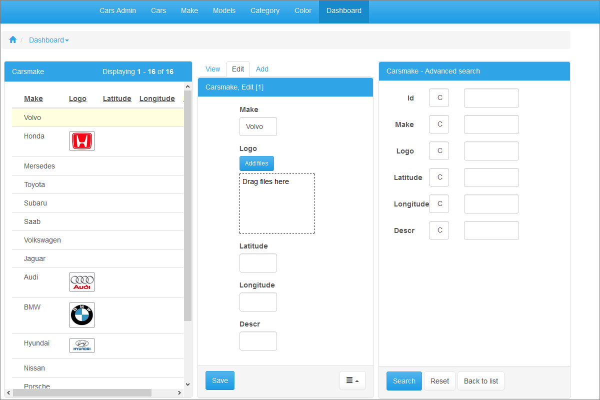
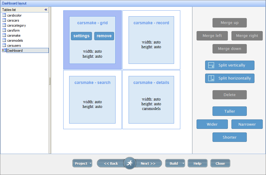
Here is an example of a dashboard with a grid, single record, and search:
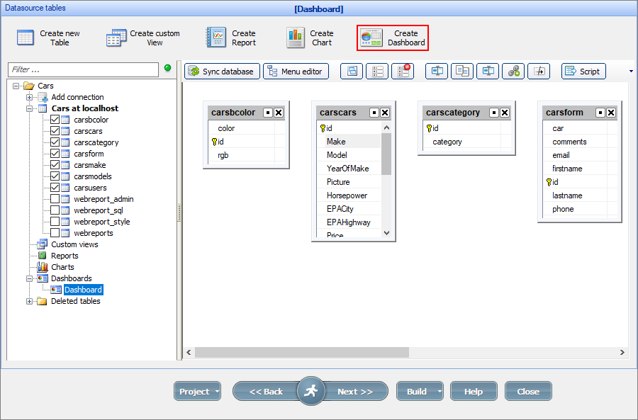
To create a dashboard, proceed to the Tables page, click Create dashboard, name it, and click OK.
Note: It is possible to create a copy of an existing dashboard (right-click the dashboard and select Copy).
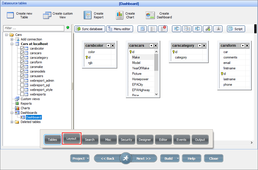
To edit the layout of the dashboard, select the dashboard and go to the Layout page. Alternatively, you can select the dashboard on the Tables page and click Next.
Customizing the layout of the dashboard
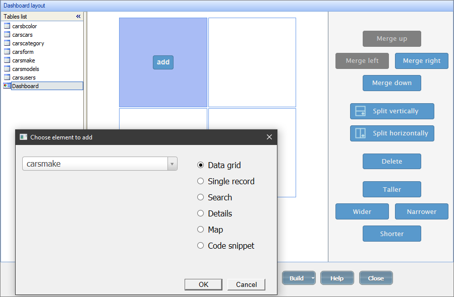
On the Dashboard layout screen, you may select dashboard elements and use the buttons on the right-side panel to change the layout. You can change the number of available dashboard elements with the Merge and Split buttons.
Click Add to add an element to the dashboard. You can choose between a data grid, single record, search, details, map or code snippet to use with the selected table in the dropdown.
Click Settings on the added dashboard element to customize its appearance. Click Remove to delete it.
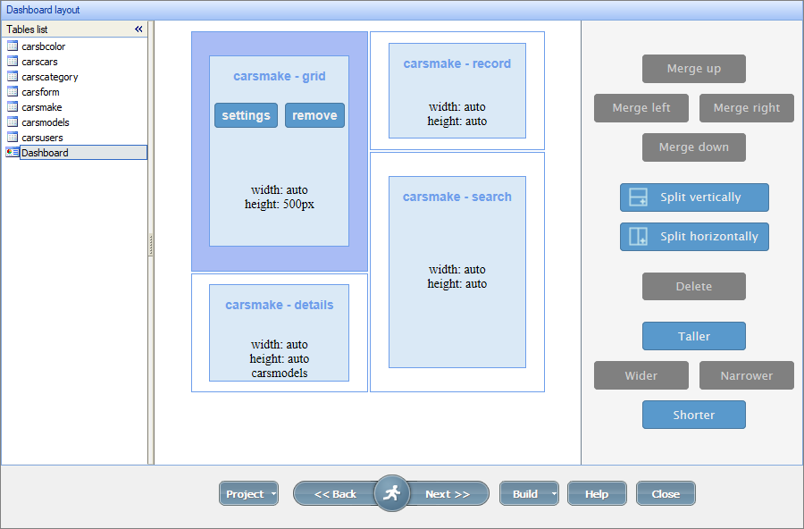
If a dashboard element has a strongly differing width or height, you may use the Taller/Shorter and Wider/Narrower buttons to change the dimensions of the element. In the example below, the carsmake-record element is made shorter.
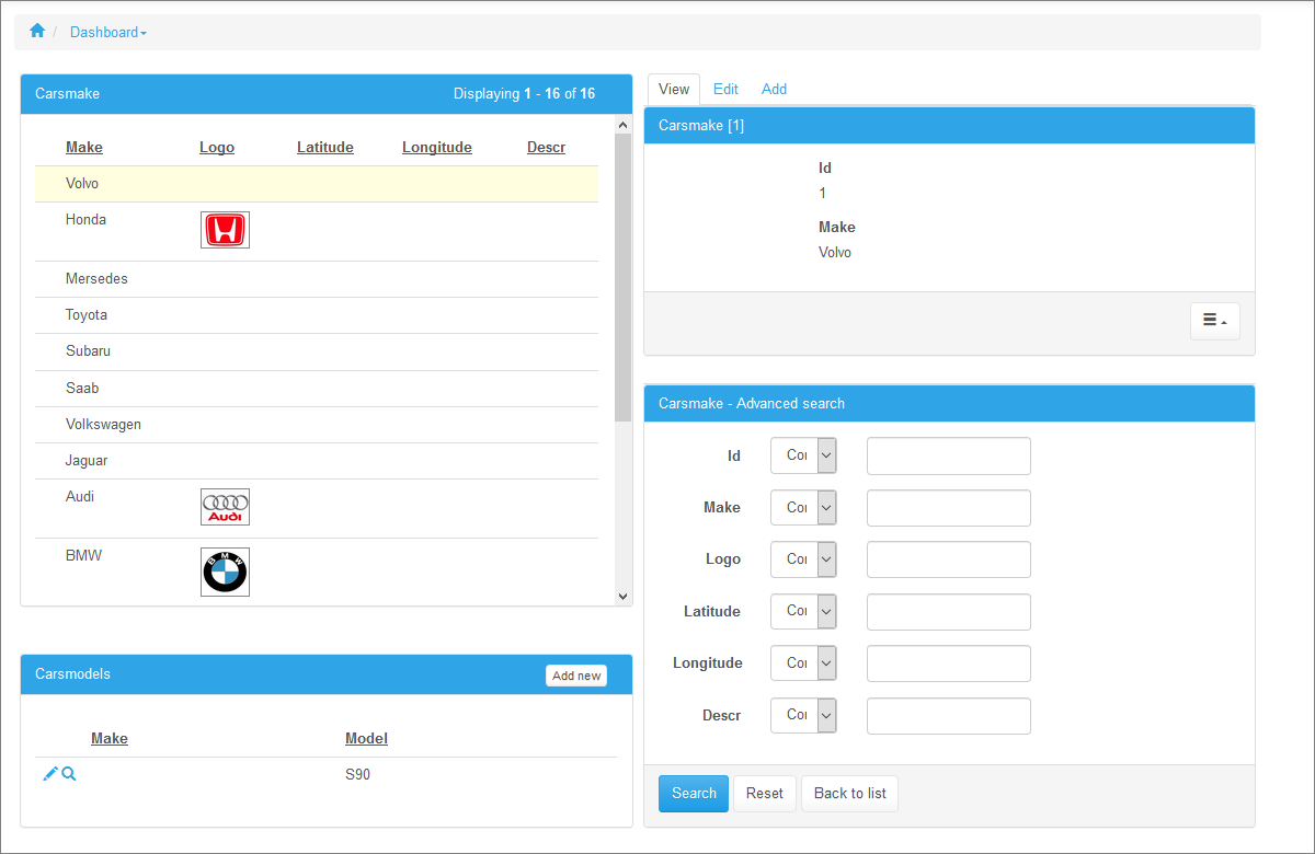
Here is how it looks like in the browser:
This element displays a data grid of the selected table.
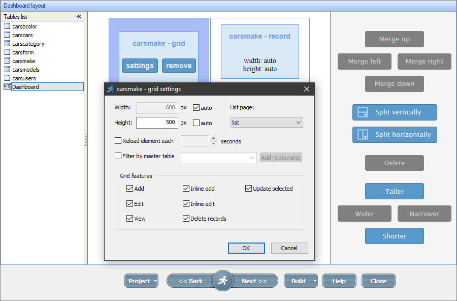
Settings
•Width/Height. These options define the width and height of the data grid. Select the auto checkboxes to make the grid take the space needed to show all of its elements.
•List page. If you have several List pages for the table, you can select the page to show in the dashboard element. Alternatively, you can create a new page with the default appearance. For more information, see Working with additional pages.
•Reload element each X seconds. You can set the element to reload each X seconds so that it accurately shows the current records.
•Filter by master table. This option makes dashboard elements display the data depending on other dashboard elements. You can use this option for cascading master-details elements (for example, customers -> orders -> order details), or when a map is used as the details. For more information, see Master-details dashboard.
•Grid features. You can select the grid features to be displayed in the data grid element. For more information, see Choose pages screen.
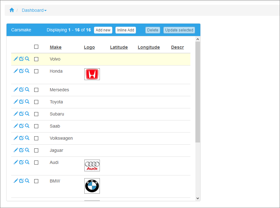
Here is an example of a dashboard with a data grid:
This element displays the View/Add/Edit page for a single record of the selected table.
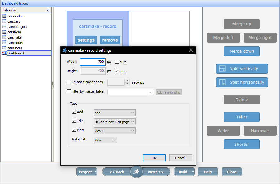
Settings
•Width/Height. These options define the width and height of the single record element. Select the auto checkboxes to make the single record take the space needed to show all of its elements.
•Reload element each X seconds. You can set the element to reload each X seconds so that it accurately shows the current records.
•Filter by master table. This option makes dashboard elements display the data depending on other dashboard elements. You can use this option for cascading master-details elements (for example, customers -> orders -> order details), or when a map is used as the details. For more information, see Master-details dashboard.
•Tabs. You can select the View/Add/Edit tabs to be displayed in the element. If you have several View, Add, or Edit pages, you can select the pages to show in the dashboard element with the dropdown next to the respective checkbox. Alternatively, you can create a new page with the default appearance. For more information, see Working with additional pages.
Note: you can also select the initial tab - that tab will be active when the page is loaded.
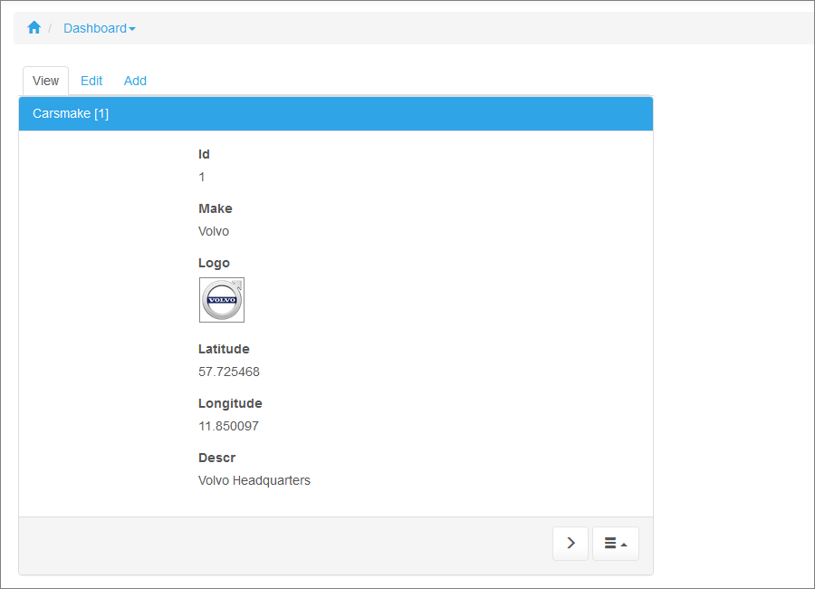
Here is an example of a dashboard with a single record:
This element displays the Advanced search page for the selected table. The search results are displayed in a Data grid or a Single record element, so you need to have one of them on the dashboard page as well.
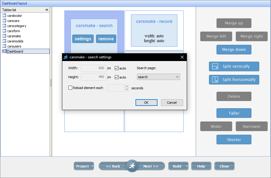
Settings
•Width/Height. These options define the width and height of the search element. Select the auto checkboxes to make the element take the space needed to show all of its content.
•Reload element each X seconds. You can set the element to reload each X seconds so that it accurately shows the current records.
•Search page. If you have several Search pages, you can select the page to show in the dashboard element. Alternatively, you can create a new page with the default appearance. For more information, see Working with additional pages.
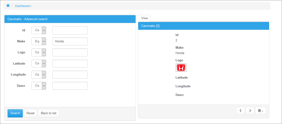
Here is an example of a dashboard with a search and a single record:
This element displays the details tables for the selected master table. If the selected table doesn't have a details table, the ASPRunnerPro warns you about it with an error message on the dashboard element. For more information about the master-details relationship, see Master-details relationship between tables.
The contents of the details element depend on the selected record in a Data grid or a Single record element, so you need to have one them on the dashboard page as well.
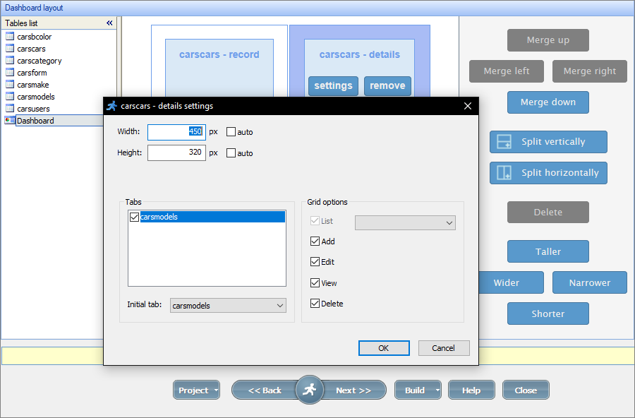
Settings
•Width/Height. These options define the width and height of the details element. Select the auto checkboxes to make the element take the space needed to show all of its records.
•Tabs. This window shows all of the details tables for the selected master table. You can switch them on and off with checkboxes. The selected details tables appear as tabs in the generated app.
Note: you can also select the initial tab - that tab will be active when the page is loaded.
•Grid options. Select the buttons/pages to appear on the details element. If you have several List pages, you can select the page to show in the dashboard element. Alternatively, you can create a new page with the default appearance. For more information, see Working with additional pages.
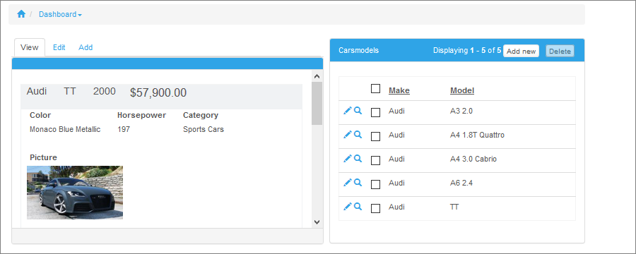
Here is an example of a dashboard with a data grid and a details element. In this example, the tables are linked through the Make field, with carscars as a master table:
This element displays the map for the selected table. The table should have the latitude and longitude fields for the map to function correctly. Alternatively, you can set up Geocoding for the address fields of the table. For more information about maps, see Insert Map.
Settings
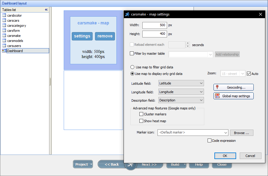
•Width/Height. These options define the width and height of the map element.
•Reload element each X seconds. You can set the element to reload each X seconds so that it accurately shows the current records.
•Filter by master table. This option makes dashboard elements display the data depending on other dashboard elements. You can use this option for cascading master-details elements (for example, customers -> orders -> order details), or when a map is used as the details. For more information, see Master-details dashboard.
•Use map to filter/display only grid data. The filter option makes the grid/record show only the records with marker icons that are visible on the map screen. The display option shows all of the records in the grid/record. In both cases, clicking on the marker icon in the map highlights the record in the data grid or the View tab of the single record element.
•Zoom. This option sets the zoom of the map to a specified level, or you can select the Auto checkbox to set the zoom level that shows all of the marker icons.
•Latitude/Longitude/Description field. Select the fields that contain latitude, longitude, and the marker icon description, respectively.
•Geocoding. This option lets the user automatically convert the address fields into the latitude and longitude to show on the map each time the records are added or updated. For more information, see Geocoding and Insert map.
•Global map settings. This option allows you to select the map provider and insert its API key if required.
•Advanced map features. The Cluster markers and Show heat map options are available only for Google maps. For more information, see Insert map.
•Marker icon. You can select and use custom marker icons instead of the default ones. Alternatively, you can use the ASP expression option to set the custom icons.
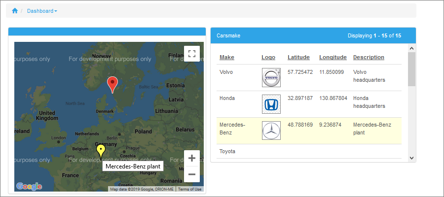
Here is an example of a dashboard with a map and a data grid with the Use map to display only grid data option enabled:
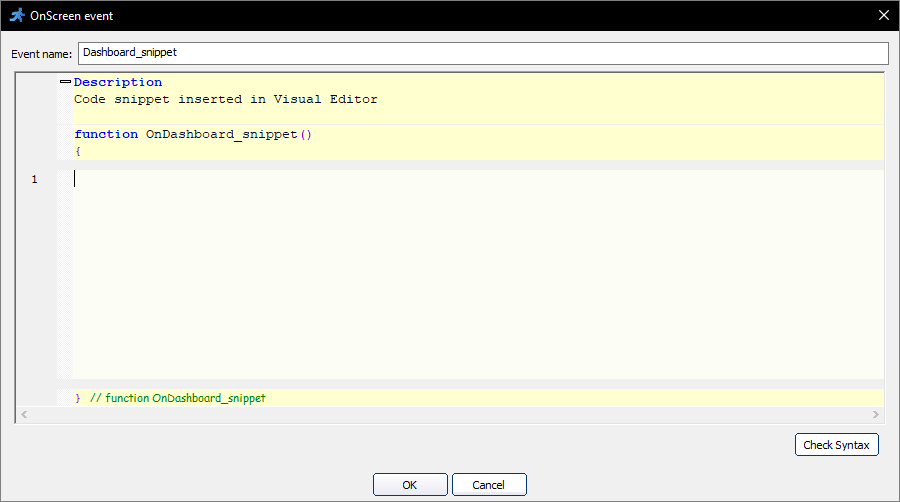
You can insert any custom code snippet as a dashboard element. To do so, click Add and select Code snippet. This code can be used to display current weather, calculate order totals, show the number of active users, or even embed a Youtube video.
When you add a Code snippet element, a popup window appears. Insert the code into this window and click OK.
The Code snippet element only has the Width/Height settings. These settings define the width and height of the element. Select the auto checkbox to make the element take the space needed to show all of its contents.
To create a custom dashboard element called "User Info" to view the current username, email and avatar, insert the code below as a Code snippet:
Dim rs,data
header = "User Info"
if bValue(Session("user_id")) then
doAssignmentByRef rs,method_DB_Query(this_object,"select * from users where id=" & CSmartStr(Session("user_id")))
doAssignmentByRef data,rs.fetchAssoc()
ResponseWrite "<table cellpadding=10px cellspacing=0px border=0>"
ResponseWrite ("<tr><td width=100px style='padding-bottom:7px'><b>Username</b></td><td>" & CSmartStr(ArrayElement(data,"displayname"))) & "</td></tr>"
ResponseWrite ("<tr><td ><b>Email</b></td><td>" & CSmartStr(ArrayElement(data,"email"))) & "</td></tr>"
ResponseWrite ("<tr><td colspan=2 style='padding-top:10px'><img width=200px src='avatars/" & CSmartStr(ArrayElement(data,"image"))) & "'></td></tr>"
ResponseWrite "</table>"
else
ResponseWrite "No information"
end if
As a result, users can see their user info in the dashboard:

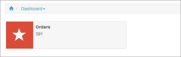
You can also customize the dashboard elements further with Custom CSS. For example, to show the total number of orders, add this code snippet to the dashboard element:
dim res, rs, data
doAssignmentByRef rs,method_DB_Query(this_object, "select count(id) as cnt FROM orders")
doAssignmentByRef data,rs.fetchAssoc()
res = "<div class='info-box'>"
res = res & "<span class='info-img img_bgcolor_red glyphicon glyphicon-star'></span>"
res = res & "<div class='dashtext'>"
res = res & "<b>Orders</b><br>"
res = res & data("cnt")
res = res & "</div>"
res = res & "</div>"
ResponseWrite res
Proceed to the Style Editor for the dashboard page and insert this code as a Custom CSS:
.panel-heading{
display:none;
}
.panel-body{
padding:0px !important;
}
.panel-primary {
border-color: white !important;
}
.panel {
margin-bottom: 0px !important;
border: 0px !important;
}
.info-box{
display: block;
min-height: 90px;
width: 100%;
border-radius: 2px;
}
.info-img{
display: block;
float: left;
height: 90px;
width: 90px;
text-align: center;
font-size: 45px;
line-height: 90px;
color:white;
}
.img_bgcolor_red{
background-color:#dd4b39 !important;
}
.dashtext{
border-radius: 2px;
border: 1px solid #e6e6e6;
min-height: 91px;
padding:7px;
padding-left:97px;
line-height: 1.6em;
background-color:#f5f5f5;
}
Here is how the result looks like:
Note: See this live demo for inspiration.
See also:
•Master-details relationship between tables
•Creating and configuring reports