Description
A Gauge chart presents a value on a graduated scale or dial. There are two Gauge chart types: Circular Gauge and Linear Gauge.
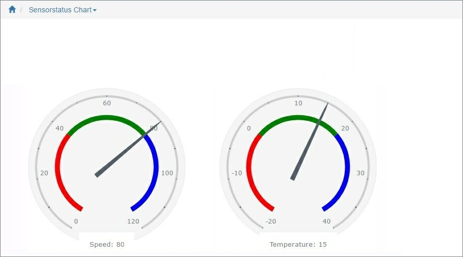
The Circular Gauge looks like the gauges on car dashboards. It consists of a radial scale as the data range, and a pointer. The Circular Gauge can show different range intervals in different colors.
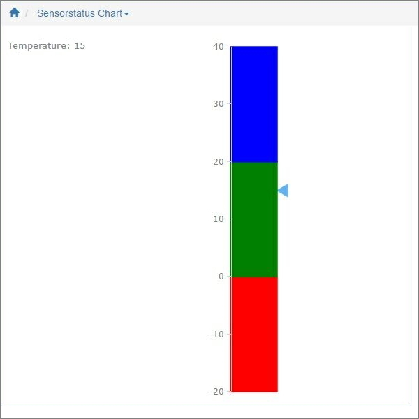
The Linear Gauge works similarly to the Circular Gauge, but presents the data in a straight line. It can be either vertical or horizontal.
You can display one or several gauges on a chart by choosing one or several Data series. Also you can define the minimum and maximum values.
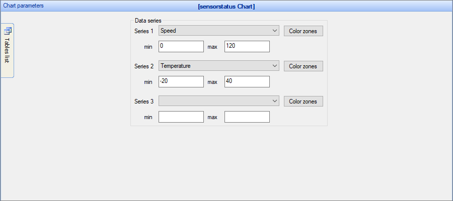
Color zones can show different colored intervals on the gauge. You can set the interval colors and their borders.
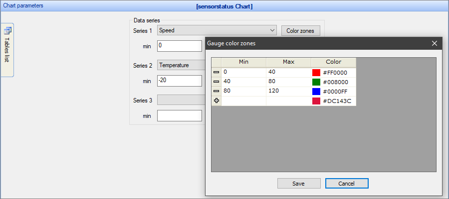
Chart settings
•Gauge style - this option defines the gauge appearance (circle, horizontal linear, vertical linear).
Examples of gauge chart types
Circular Gauge chart with two Data series selected
Vertical Linear Gauge chart
Other chart types:
•Financial OHLC/Candlestick charts
See also:
•Using SQL to shape chart data