Description
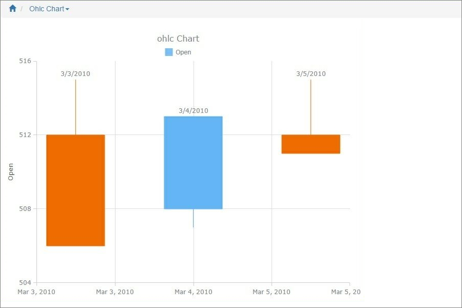
An OHLC chart is a type of Bar chart that shows Open, High, Low, and Closing prices for each period. Each vertical line on the chart shows the price range (the highest and lowest prices) over one unit of time, e.g., one day or one hour. Tick marks project from each side of the line indicating the opening price (e.g., for a daily OHLC chart this would be the starting price for that day) on the left, and the closing price for that time period on the right.
The Japanese Candlestick chart is another way of displaying market price data, with the opening and closing prices defining a rectangle within the range for each time unit. The rectangles have different colors depending on whether prices rose or fell in that period.
Both charts show the exact same data, i.e., the opening, high, low, and closing prices during a particular time frame. Some traders find the candlestick chart easier to read.
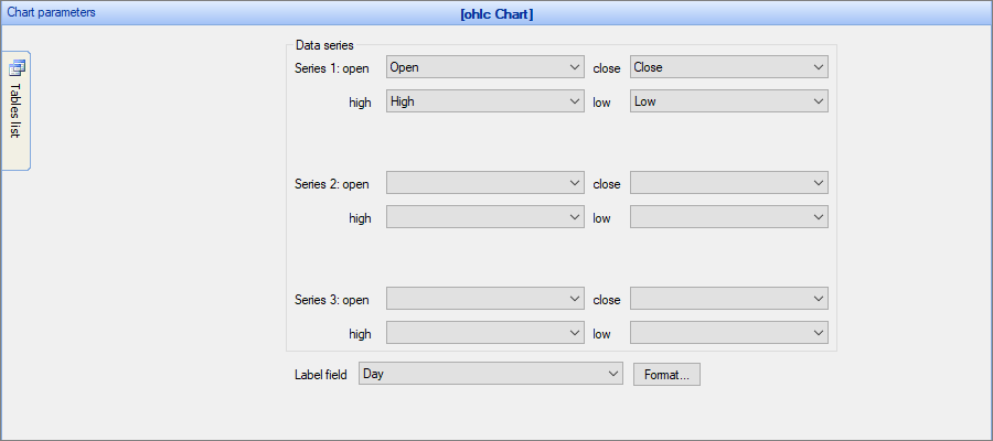
OHLC/Candlestick chart may contain single series or multi-series data fields. These charts use four values: open, high, low and closing price values. You also need to select the Label field.
Example of a Candlestick chart
Sample data table:
Day |
Open |
High |
Low |
Close |
03-Mar-10 |
512.00 |
515.00 |
506.10 |
506.00 |
04-Mar-10 |
508.00 |
513.00 |
507.00 |
513.00 |
05-Mar-10 |
512.00 |
515.00 |
511.00 |
511.00 |
In this example, we chose Open, High, Low, Close as the Data Series fields, Day as the Label field.
Other chart types:
See also:
•Using SQL to shape chart data