The Chart Appearance screen allows you to control the way your chart looks in the generated app.
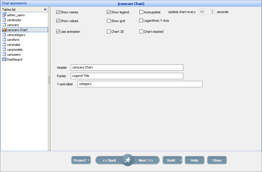
Chart appearance options
•Select the Autoupdate checkbox to auto-refresh the chart every N seconds.
•The Use animation checkbox enables the chart animation upon opening a chart.
•Use the Logarithmic Y-Axis option to convert a linear value axis to a logarithmic value axis.
If you select one of the 2D charts (e.g., 2D Column chart), additional options become available:
•Use the Chart 3D option to build a 3D chart instead of a 2D one.
•Use the Chart stacked option to display a chart where the chart elements are stacked on top of each other.
Note: the Y-axis label input box appears only if you have multiple Data series fields.
For more information about each chart type settings, see Chart types.
Additional customization
1. Charts can be resized on the Editor screen.
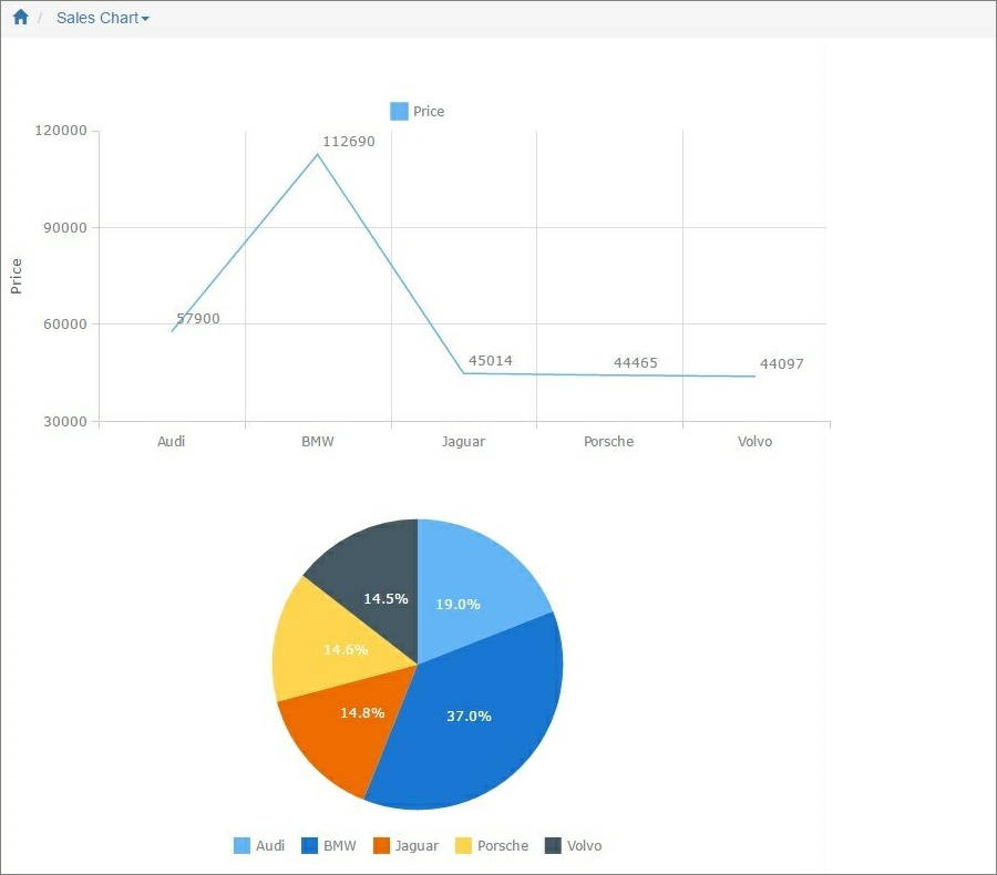
2. With the Editor, you can copy the chart to another page (a Report/List/View or another chart page). It can be useful to build a dashboard containing several charts.
3. To further customize the chart appearance like colors, fonts, or the chart title, use the ChartModify event.
See also:
•Using SQL to shape chart data