The Date is a date edit control. The regional date appearance can be selected in the Date dropdown.
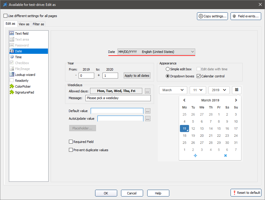
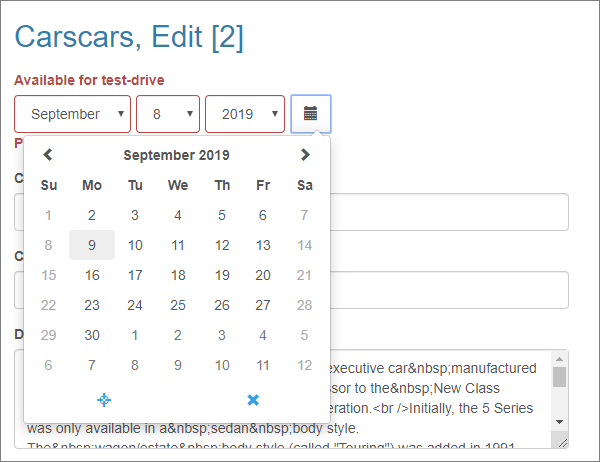
•Appearance. You can choose between Simple edit box and Dropdown boxes styles of the Date field. Select the Calendar control checkbox to enable a calendar popup for picking a date.
Note: a Simple edit box allows entering time as well as the date. Select the Edit date with time checkbox to do so.
•Year. Limit the range of years to choose from with the From and To fields. The Apply to all dates option applies the selected limit to every Date field in the app.
•Weekdays. This option allows limiting the weekdays, that the user can choose in the Date control. To select the allowed days in the popup, press the ... button. The Message field allows showing a custom message when the user picks a disallowed day.
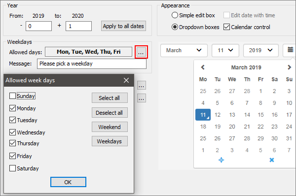
Note: you can also allow certain days, or limit the allowed date intervals with the Date API.
Examples
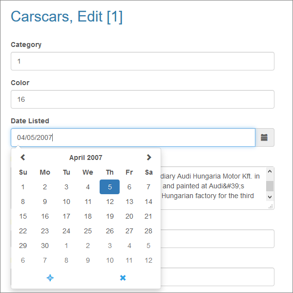
1. A simple edit box style Date field with a Calendar control (inline mode):
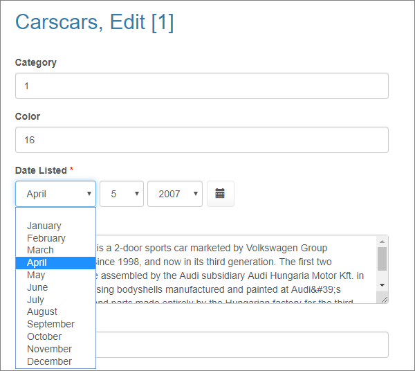
2. A dropdown boxes style required Date field with a Calendar control:
3. A dropdown boxes style Date field with a Calendar control, limited to weekdays only.
See also: